
Mapping JupyterLab’s user interface to source code
Contents
Mapping JupyterLab’s user interface to source code#
Last updated on: January 18, 2022
Introduction#
The purpose of this document is to help orient frontend developers to the JupyterLab codebase.
Required reading for this document is the sequence of pages in the JupyterLab docs beginning with General Codebase Orientation.
Source code versions#
This document contains a large number of links to specific lines of code. Because JupyterLab is constantly evolving and changing, it’s important to peg the links to specific code versions.
For JupyterLab code links, we use v4.0.0a18 for this document.
For links to Lumino source, we use v2021.12.13.
Original source code for this document, including the
.drawiofile used to generate all the images in this doc, can by found by going to https://github.com/gabalafou/map-jupyterlab-frontend-components.
Scope#
JupyterLab loads many front-end components into its default user interface. This document does not attempt to exhaustively map all parts of the interface to the source code. Rather it focuses on a subset of the UI.
Approach#
This document is organized by actual DOM nodes in the browser that JupyterLab creates. Each section below covers a single node. In general, as you go from beginning to end, the nodes become more and more deeply nested.
Lumino and JupyterLab#
JupyterLab is built on top of Lumino. In other words, Lumino is a dependency of JupyterLab, but JupyterLab is not a dependency of Lumino. Lumino provides a set of classes for creating common UI elements, such as tab bars, menus, panels, and more. Lumino also provides an architecture for plugins.
Every UI element in JupyterLab ultimately inherits from the Lumino Widget class. A widget in Lumino is essentially what is sometimes called a frontend component in other libraries. It’s a class that wraps a DOM node, providing a piece of the UI.
Point of entry#
It’s hard to say where exactly the point of entry is for an application as big
and complex as JupyterLab, but for our purposes, it’s new JupyterLab().start()
in lines 177-191 of
jupyterlab/staging/index.js.
The JupyterLab class inherits from JupyterFrontEnd class, which in turn inherits from Lumino Application.
The JupyterLab class constructor creates a LabShell
instance
if one is not passed in. LabShell is defined in
packages/application/src/shell.ts,
which is a key file to understanding how the JupyterLab UI is laid out. The base
Lumino Application class points this.shell to the LabShell
instance,
so lab.shell is the root Lumino widget in the hierarchy of Lumino widgets.
Within the JupyterLab source code, you will often see it referred to as
app.shell.
The start method is defined in the Application class. For each plugin that has been registered, it calls activate on that plugin, passing in the plugin’s declared requirements to the activate function. In JupyterLab, plugins are defined in packages that have -extension at the end of the name. For example, mainmenu-extension defines a plugin that adds the main menu bar to the JupyterLab interface.
DOM Nodes#
The rest of the document maps DOM nodes in the JupyterLab UI to related points of interest in the source code. Each section represents a single DOM node.
Application shell#
The application shell is the entire user interface of the application. It includes the top, bottom, and sidebars, as well as the main content area (and other areas not covered by this document).
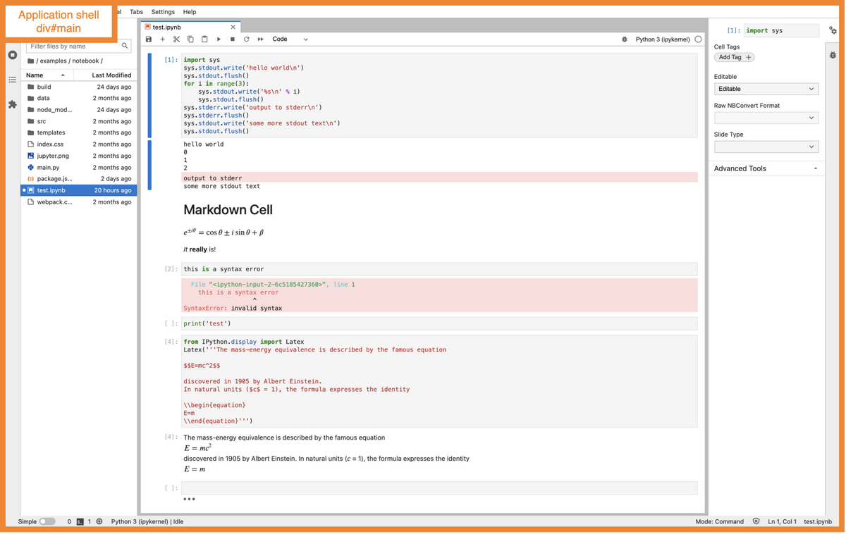
Node-to-node CSS selector path for this node:
html > body > div#main
Table of properties:
Name |
Value |
|---|---|
HTML tag |
div |
HTML id |
|
CSS class |
|
Controlling class |
Steps to mount:
Within the start method, invoke the attach shell method
Attach shell to DOM. In a default JupyterLab instance, the shell node will be appended to the end of the document body.
Top container#
The top area includes the Jupyter logo and the main menu bar (File, Edit, View, etc).
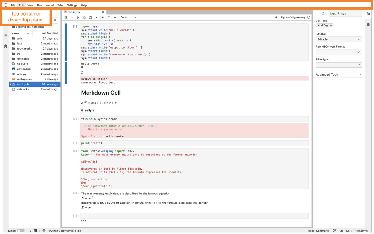
Node-to-node CSS selector path for this node:
div#main > div#jp-top-panel
Table of properties:
Name |
Value |
|---|---|
HTML tag |
div |
HTML id |
|
HTML role |
|
Controlling class |
PanelHandler, a private class that wraps Lumino Panel |
Shell area |
Steps to mount:
Create handler for top panel. When the handler is created, a new Lumino Panel is created.
Assign layout to shell widget. This invokes the Lumino Widget layout setter, which in turn invokes the parent setter for BoxLayout which it inherits from Layout. This in turn calls the initialization method of the BoxLayout, which it inherits from PanelLayout. The init method attaches the widget.
Assigning the layout attaches the top panel to the DOM
Middle container#
The middle node contains everything (nearly) between the top and the bottom areas: the left sidebar, the main document area, and the right sidebar. (Not covered in this document: it also contains the Log Console when it’s displayed.)
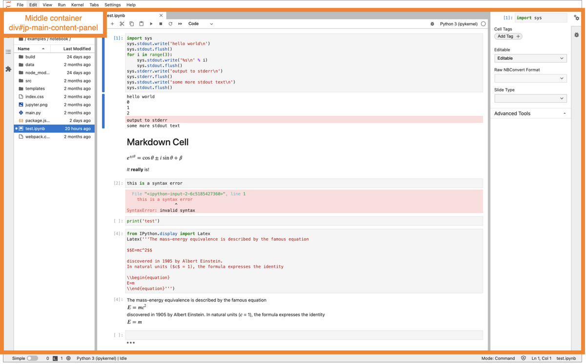
Node-to-node CSS selector path for this node:
div#main > div#jp-main-content-panel
Table of properties:
Name |
Value |
|---|---|
HTML tag |
div |
HTML id |
|
Controlling class |
Steps to mount:
The rest of the steps for mounting the middle container are like the steps in mounting the top container.
Bottom container#
The bottom area contains the status bar.
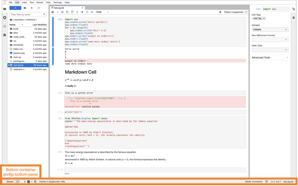
Node-to-node CSS selector path for this node:
div#main > div#jp-bottom-panel
Table of properties:
Name |
Value |
|---|---|
HTML tag |
div |
HTML id |
|
HTML role |
none |
Controlling class |
|
Shell area |
Steps to mount:
The rest of the steps for mounting the bottom container are like the steps in mounting the top and middle containers.
Logo#
The Jupyter logo appears in the top area.
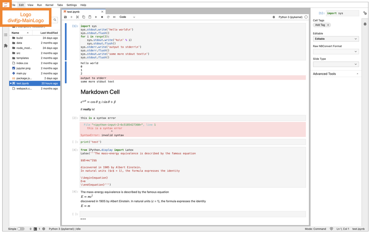
Node-to-node CSS selector path for this node:
div#main > div#jp-top-panel > div#jp-MainLogo
Table of properties:
Name |
Value |
|---|---|
HTML tag |
div |
HTML id |
|
Controlling class |
Steps to mount:
The shell passes the logo to its top handler
The top handler passes the logo to its Lumino panel
The panel passes the logo to its layout
The panel layout mounts the logo to the DOM
Top menu bar container#
The menu area contains the main menu bar (File, Edit, View, etc).
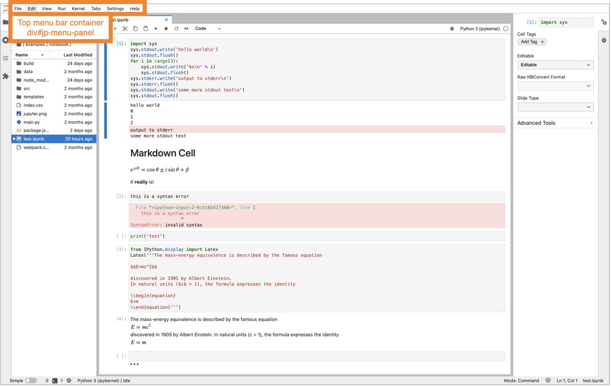
Node-to-node CSS selector path for this node:
div#main > div#jp-top-panel > div#jp-menu-panel
Table of properties:
Name |
Value |
|---|---|
HTML tag |
div |
HTML id |
|
HTML role |
|
aria-label |
|
Controlling class |
PanelHandler, a private class that wraps Lumino Panel |
Shell area |
Steps to mount:
Add menu area handler to top handler. Note: this applies only in multiple document mode, which is the default; we do not cover single document mode in this doc.
The menu area handler is then mounted with the top handler (see steps for mounting top container, above).
Left sidebar#
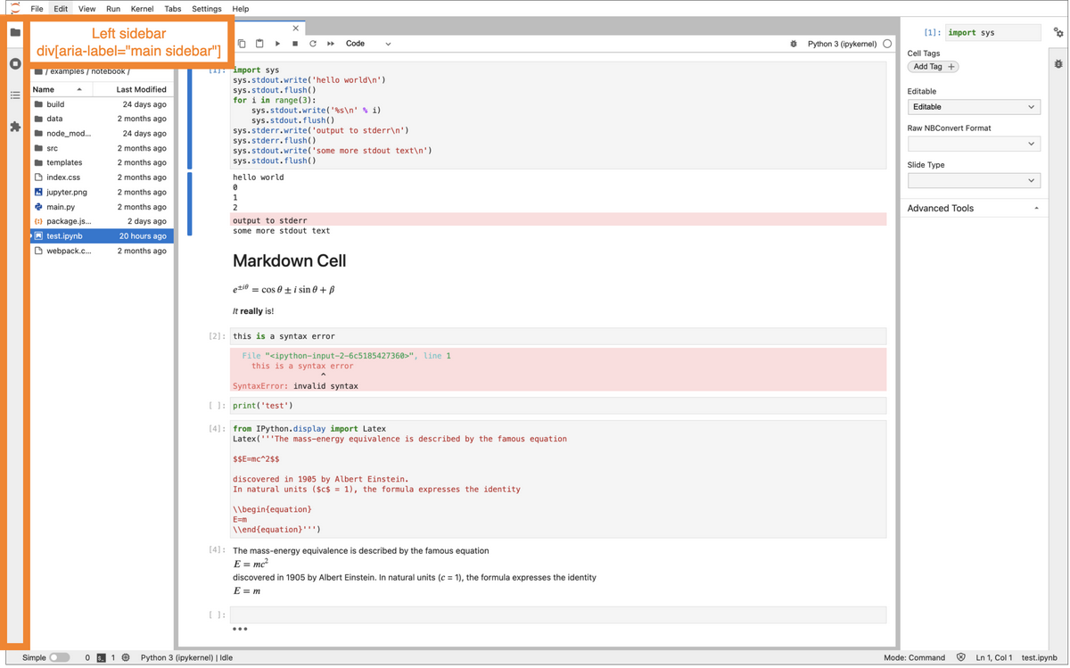
Node-to-node CSS selector path for this node:
div#main > div#jp-main-content-panel >
div[aria-label="main sidebar"]
Table of properties:
Name |
Value |
|---|---|
HTML tag |
div |
HTML id |
none |
CSS classes |
|
HTML role |
|
aria-label |
|
Controlling class |
Steps to mount:
This node gets attached to the DOM with the middle container (see steps to mount the middle container, above).
Main vertical split panel#
This node allows the area inside the UI that is surrounded by top, bottom, and sidebars to be divided into two top and bottom parts. This appears to be primarily for providing a place to display the Log Console, which this document does not go into.
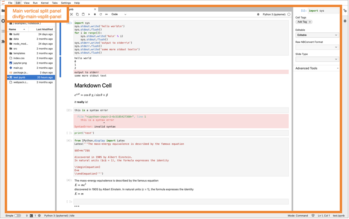
Node-to-node CSS selector path for this node:
div#main > div#jp-main-content-panel > div#jp-main-vsplit-panel
Table of properties:
Name |
Value |
|---|---|
HTML tag |
div |
HTML id |
|
Controlling class |
Steps to mount:
This node gets attached to the DOM with the middle container (see steps to mount the middle container, above).
Right sidebar#
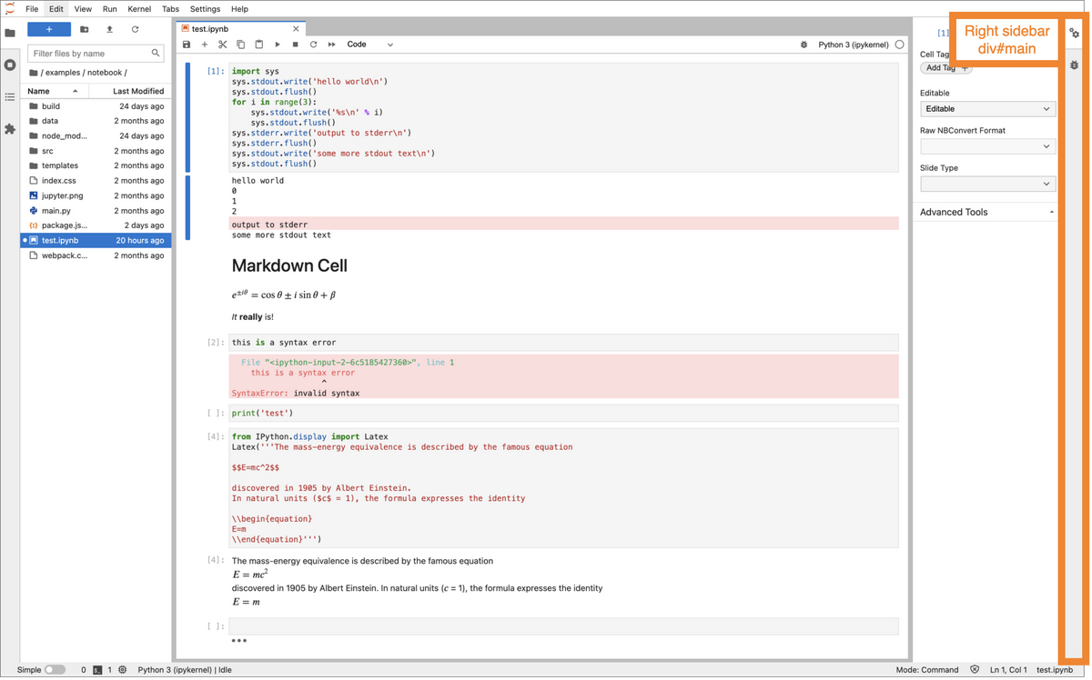
Node-to-node CSS selector path for this node:
div#main > div#jp-main-content-panel >
div[aria-label="alternate sidebar"]
Table of properties:
Name |
Value |
|---|---|
HTML tag |
div |
HTML id |
none |
CSS class |
|
HTML role |
|
aria-label |
|
Controlling class |
Steps to mount:
This node gets attached to the DOM with the middle container (see steps to mount the middle container, above).
Status bar#
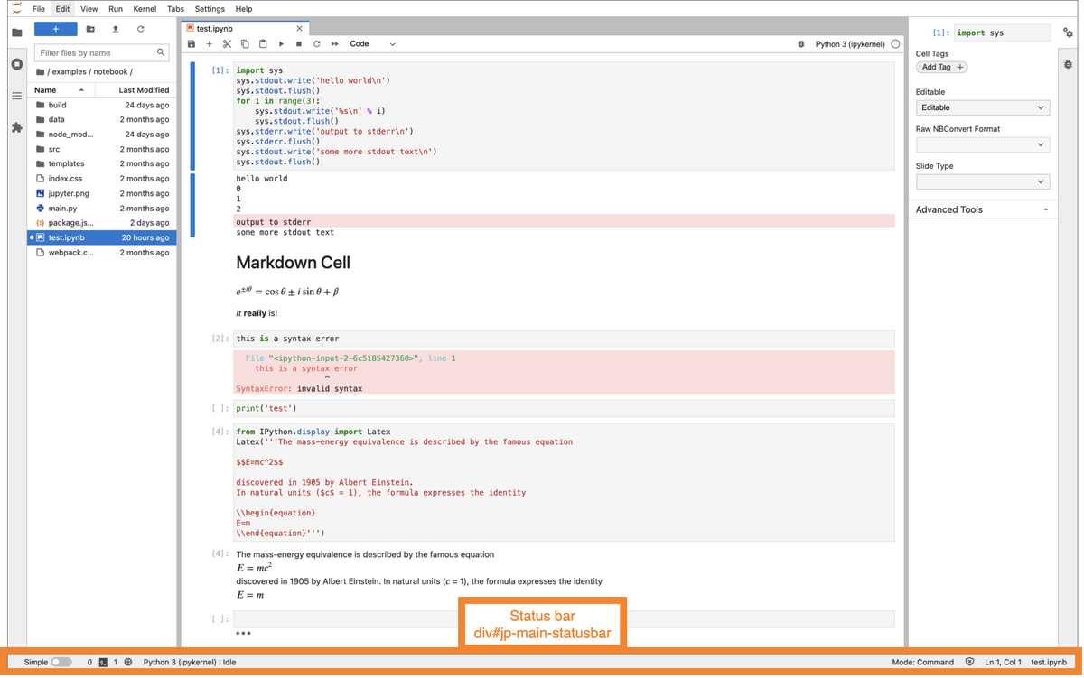
Node-to-node CSS selector path for this node:
div#main > div#jp-bottom-panel > div#jp-main-statusbar
Table of properties:
Name |
Value |
|---|---|
HTML tag |
div |
HTML id |
|
Controlling class |
StatusBar extends Lumino Widget |
Steps to mount:
This node then gets attached to the DOM with the bottom container (see steps to mount the bottom container, above).
Main menu bar#
The main menu bar appears at the top and contains the menu items: File, Edit, View, etc.
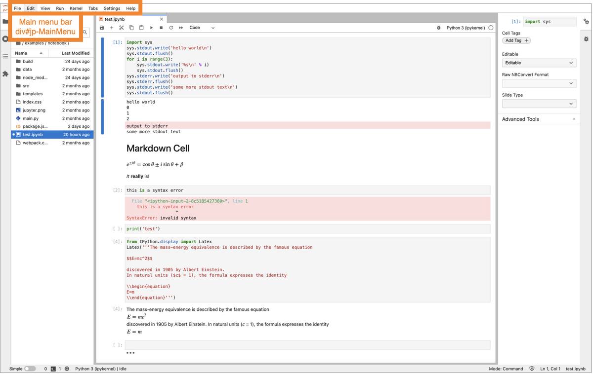
Node-to-node CSS selector path for this node:
div#main > div#jp-top-panel > div#jp-menu-panel > div#jp-MainMenu
Table of properties:
Name |
Value |
|---|---|
HTML tag |
div |
HTML id |
|
Controlling class |
MainMenu extends Lumino MenuBar |
Author: Gabriel Fouasnon
Note
This set of steps is nearly identical to the set of steps to mount the Jupyter logo.
The shell passes the menu bar to its menu handler
The menu handler passes the menu bar to its Lumino panel
The panel passes the menu bar to its layout
The panel layout mounts the menu bar to the DOM
Main horizontal split panel#
The horizontal split panel contains the left area panel, the main area panel, and the right area panel.
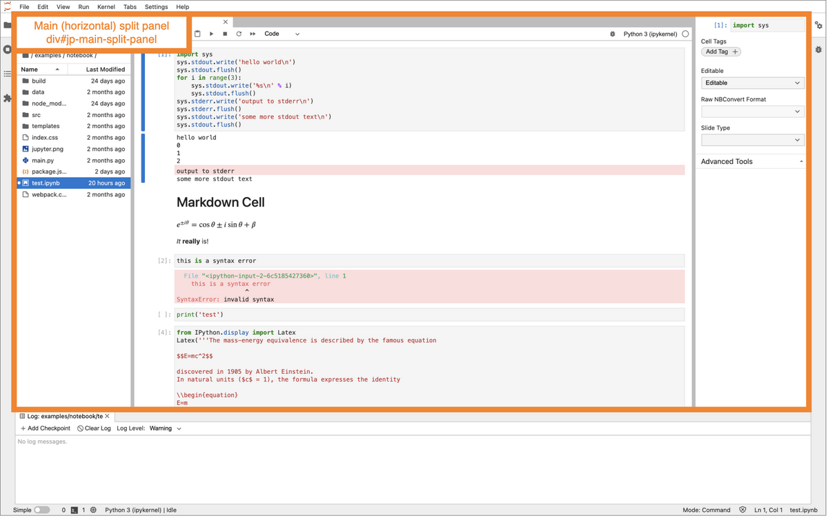
Node-to-node CSS selector path for this node:
div#main > div#jp-main-content-panel >
div#jp-main-vsplit-panel > div#jp-main-split-panel
Table of properties:
Name |
Value |
|---|---|
HTML tag |
div |
HTML id |
|
Controlling class |
Steps to mount:
This node gets attached to the DOM with the vertical split panel (see steps to mount the vertical split container, above).
Status bar left panel#
The status bar has three sections: left, middle, and right. Here we cover the left section.
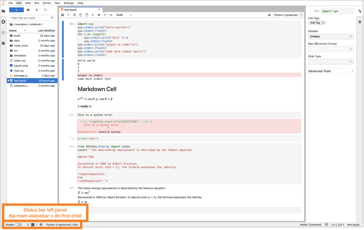
Node-to-node CSS selector path for this node:
div#main > div#jp-bottom-panel > div#jp-main-statusbar >
div:first-child
Table of properties:
Name |
Value |
|---|---|
HTML tag |
div |
HTML id |
none |
Controlling class |
Steps to mount:
This node will then get attached to the DOM when the status bar gets attached.
Main menu bar item: “File”#
A menu item is a clickable area labeled with text. It belongs to either a menu or a menu bar. For example, the word “File” in menu bar is a menu item, and within the file menu, the word “New Launcher” is a menu item. Clicking a menu item either opens a sub-menu or executes a command.
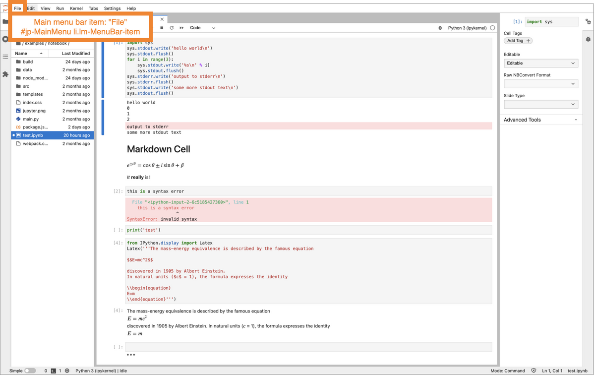
Node-to-node CSS selector path for this node:
div#main > div#jp-top-panel > div#jp-menu-panel >
div#jp-MainMenu > ul[role="menubar"] > li[role="menuitem"]
Table of properties:
Name |
Value |
|---|---|
HTML tag |
li |
HTML id |
none |
tabindex |
|
HTML role |
|
aria-haspopup |
|
Controlling class |
Steps to mount:
To make this concrete, we will follow the steps to mount the “File” menu item.
Apply the label to the file menu. This involves a lot of steps, some of which we are going to skip here. First, load the menu JSON. Then pass the menu JSON along with a factory function to MenuFactory.createMenus() method, which transforms the JSON data and passes it to the factory function, which passes to the class method MainMenu.generateMenu. The important line in that function is where it sets the menu title to the label we provided.
Add the file menu to the main menu. Internally, this calls the Lumino TabBar insertMenu() method, which in turn calls its update() method, which in turn causes the onUpdateRequest handler to get called.
When the menu bar gets attached to the DOM, the menu item will also get attached to the DOM.
A tab in the left sidebar: file browser#
These are clickable icons in the sidebar that open a panel in the left area when clicked. By default these include: file browser, running terminal and kernels, table of contents, and extension manager.
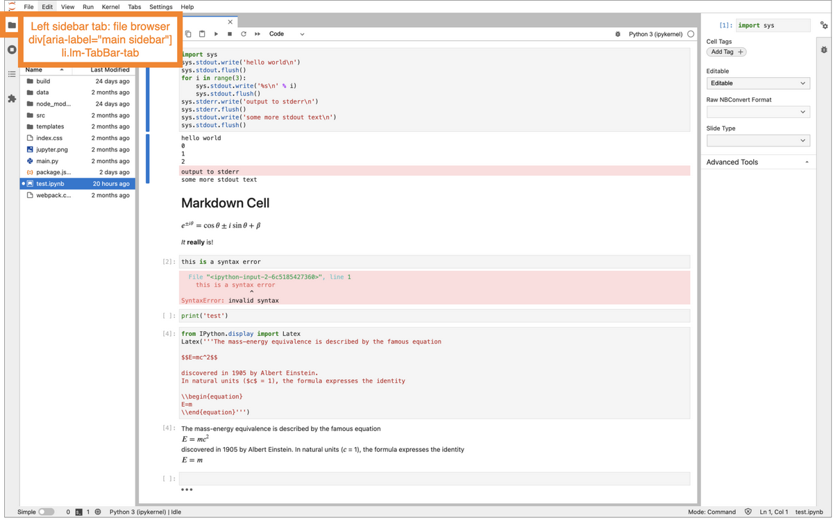
Node-to-node CSS selector path for this node:
div#main > div#jp-main-content-panel >
div[aria-label="main sidebar"] >
ul[aria-label="main sidebar"] >
li[role="tab"]
Table of properties:
Name |
Value |
|---|---|
HTML tag |
li |
HTML id |
tab-key-0 (for example) |
HTML title |
File Browser (⇧ ⌘ F) (for example) |
tabindex |
none |
HTML role |
|
aria-selected |
|
Controlling class |
Steps to mount:
Note that the steps to mount a tab in left sidebar are similar to the steps to mount a menu item in the main menu bar. We will use the file browser as a concrete example.
Ask the shell to add the file browser widget to the left area. The shell passes the widget to its left handler. The left handler passes the widget’s title to its Lumino TabBar instance.
Insert tab object into tab bar. This calls update(), which in turn triggers onUpdateRequest().
When the tab bar gets attached to the dom with shell’s left handler, this tab will also get mounted.
Left tab panel container#
This is the point of attachment for tab panels that are opened and closed by the left sidebar.
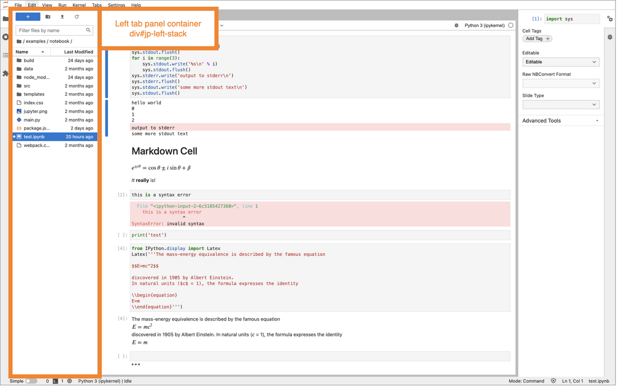
Node-to-node CSS selector path for this node:
div#main > div#jp-main-content-panel >
div#jp-main-vsplit-panel >
div#jp-main-split-panel >
div#jp-left-stack
Table of properties:
Name |
Value |
|---|---|
HTML tag |
div |
HTML id |
|
Controlling class |
|
Shell area |
Steps to mount:
This node gets attached to the DOM with the main horizontally split panel (see steps to mount the horizontally split container, above).
Main document area#
The main document area is the area in which notebooks and other documents are shown. The main area can be split vertically and then again horizontally for a 4-by-4 layout. Inside each split (whether there are no splits or 2 or 3 or 4), each document has a tab that can be dragged from one split area into another.
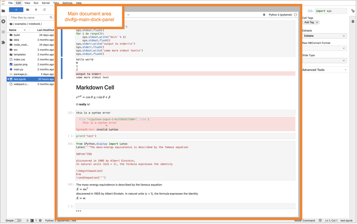
Node-to-node CSS selector path for this node:
div#main > div#jp-main-content-panel >
div#jp-main-vsplit-panel >
div#jp-main-split-panel >
div#jp-main-dock-panel
Table of properties:
Name |
Value |
|---|---|
HTML tag |
div |
HTML id |
|
HTML role |
|
Controlling class |
DockPanelSvg extends Lumino DockPanel |
Shell area |
Steps to mount:
This node gets attached to the DOM with the main horizontally split panel (see steps to mount the horizontally split container, above).
Right tab panel container#
See left tab panel container. The information is essentially the same, but the
HTML id is jp-right-stack.
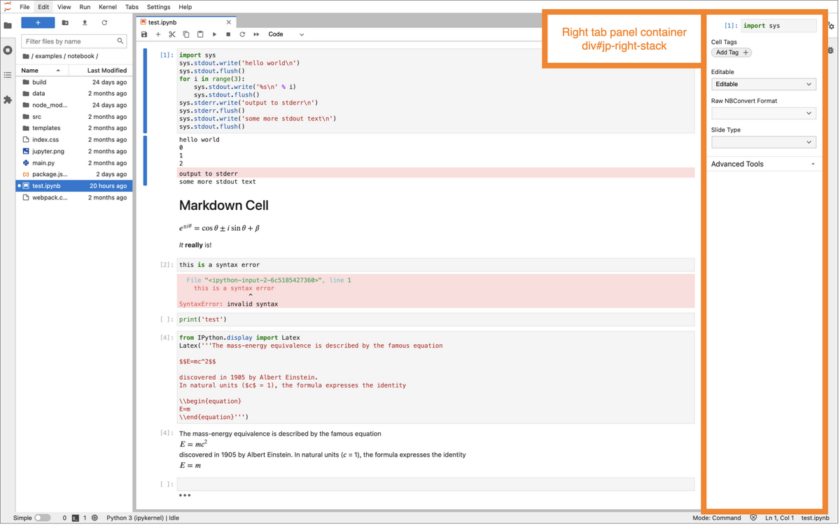
Node-to-node CSS selector path for this node:
div#main > div#jp-main-content-panel >
div#jp-main-vsplit-panel >
div#jp-main-split-panel >
div#jp-right-stack
The document mode switch in the status bar left panel#
This is the switch labeled “Simple” in the lower left of the UI, in the status bar.
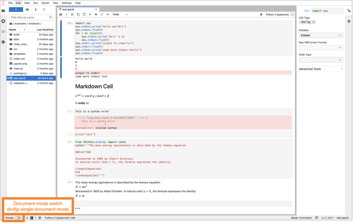
Node-to-node CSS selector path for this node:
div#main > div#jp-bottom-panel > div#jp-main-statusbar >
div:first-child >
div#jp-single-document-mode
Table of properties:
Name |
Value |
|---|---|
HTML tag |
div |
HTML id |
|
Controlling class |
Switch extends Lumino Widget |
Steps to mount:
Ask status bar to add switch to its left panel. The status bar passes the switch to its left panel, which delegates to the Lumino Panel addWidget method.
The switch is now in the tree of the status bar node, so when the status bar node get attached to the DOM, so will this node.
The file browser panel (in the left panel area)#
The file browser allows the user to interact with folders and files on their file system.
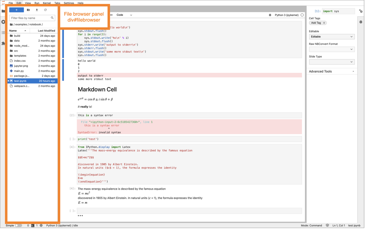
Node-to-node CSS selector path for this node:
div#main > div#jp-main-content-panel >
div#jp-main-vsplit-panel >
div#jp-main-split-panel >
div#jp-left-stack
div#filebrowser
Table of properties:
Name |
Value |
|---|---|
HTML tag |
div |
HTML id |
|
CSS class |
|
HTML role |
|
aria-label |
|
Controlling class |
FileBrowser extends Lumino Widget |
Steps to mount:
Ask shell to add widget to left area. The shell passes the file browser widget to its left handler. The left handler passes the file browser widget to its stacked panel. The stacked panel delegates to the Lumino Panel insertWidget method, which in turn delegates to PanelLayout.
The file browser panel is now in the tree of the left tab panel container, so it will be attached to the DOM when its parent is (see steps to mount the left tab panel container, above).
After the file browser widget is mounted, it gets shown and hidden via a Lumino
Signal from the TabBar. When TabBar’s currentIndex gets changed, it calls
this._currentChanged.emit, which triggers
shell._leftHandler._onCurrentChanged.
A tab bar of open documents in the main dock area#
A tab bar in the main area allows you switch between open documents within a particular split of the main dock panel.
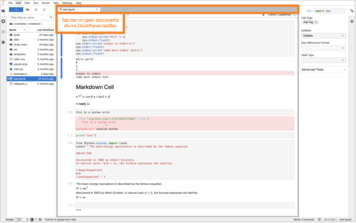
Node-to-node CSS selector path for this node:
div#main > div#jp-main-content-panel >
div#jp-main-vsplit-panel >
div#jp-main-split-panel >
div#jp-main-dock-panel >
div.lm-DockPanel-tabBar
Table of properties:
Name |
Value |
|---|---|
HTML tag |
div |
HTML id |
none |
CSS class |
|
Controlling class |
The tab bar is created by the main Lumino DockPanel instance via its private
\_createTabBar
method.
The Lumino DockLayout handles mounting the tab
bar
to the DOM.
Like the shell’s left sidebar handler, it connects a currentChanged handler to
the tab
bar,
so that when the tab changes, it can change the corresponding tab panel.
Notebook Panel#
A notebook panel is rendered into the main area. It contains a toolbar and the notebook body.
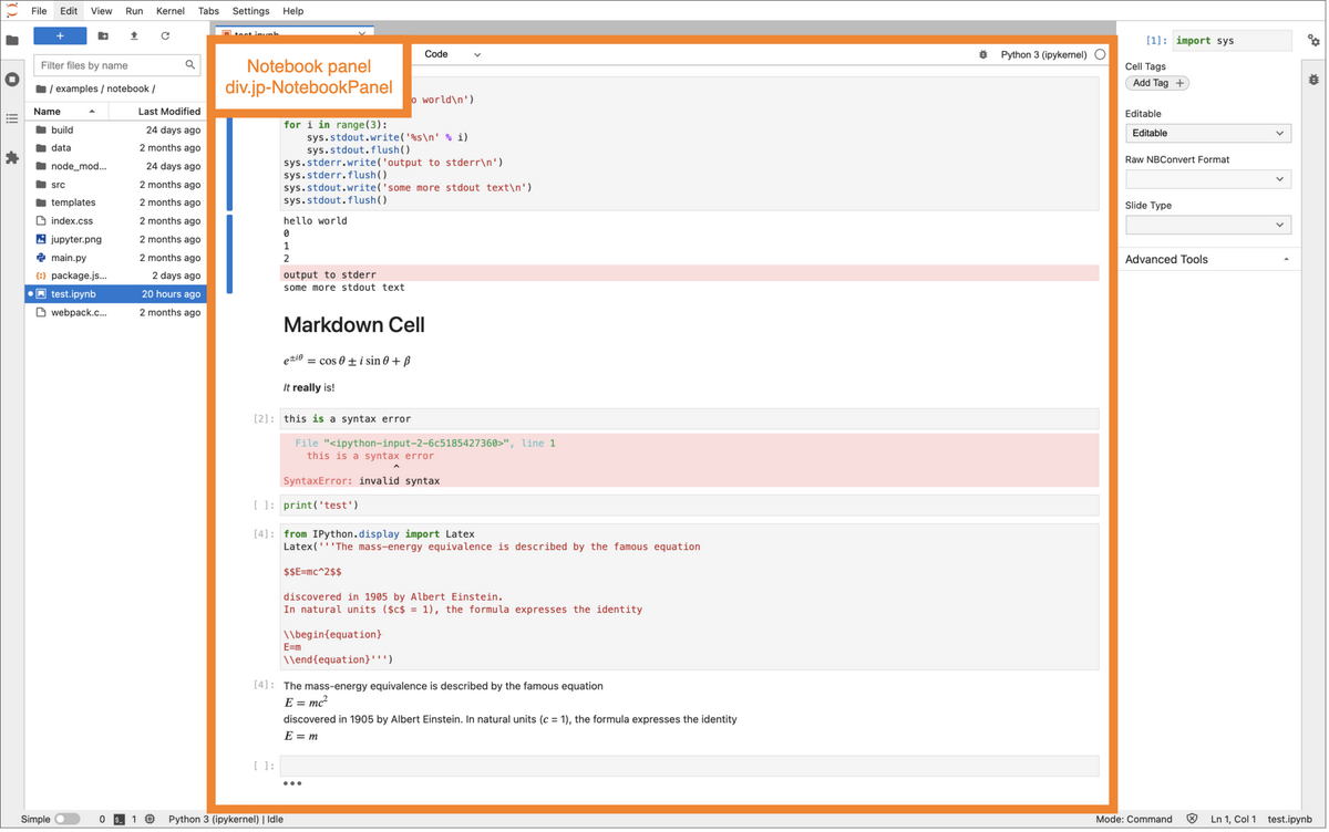
Node-to-node CSS selector path for this node:
div#main > div#jp-main-content-panel >
div#jp-main-vsplit-panel >
div#jp-main-split-panel >
div#jp-main-dock-panel >
div.jp-NotebookPanel
Table of properties:
Name |
Value |
|---|---|
HTML tag |
div |
HTML id |
|
CSS class |
|
HTML role |
|
aria-labelledby |
tab-key-0 (for example) |
Controlling class |
NotebookPanel extends DocumentWidget extends MainAreaWidget extends Lumino Widget |
Steps to mount:
There are multiple code paths to mount a notebook into the DOM. For example, using the open command from the file menu versus double clicking on a notebook file in the file browser extension.
The document manager maps the file to a widget factory based on the file’s extension. Using the factory, it creates the widget (in this case, a NotebookPanel widget).
The doc manager then asks the shell to add the widget to the main area. The shell passes the widget to its main area handler (a dock panel).
The dock panel (through its DockLayout member), attaches the notebook node to the DOM, by appending it to the main area container node (#jp-main-dock-panel).
Notebook toolbar#
The notebook toolbar is a strip of buttons rendered above the notebook to perform actions on the notebook, such as copy, paste, save, insert cell.
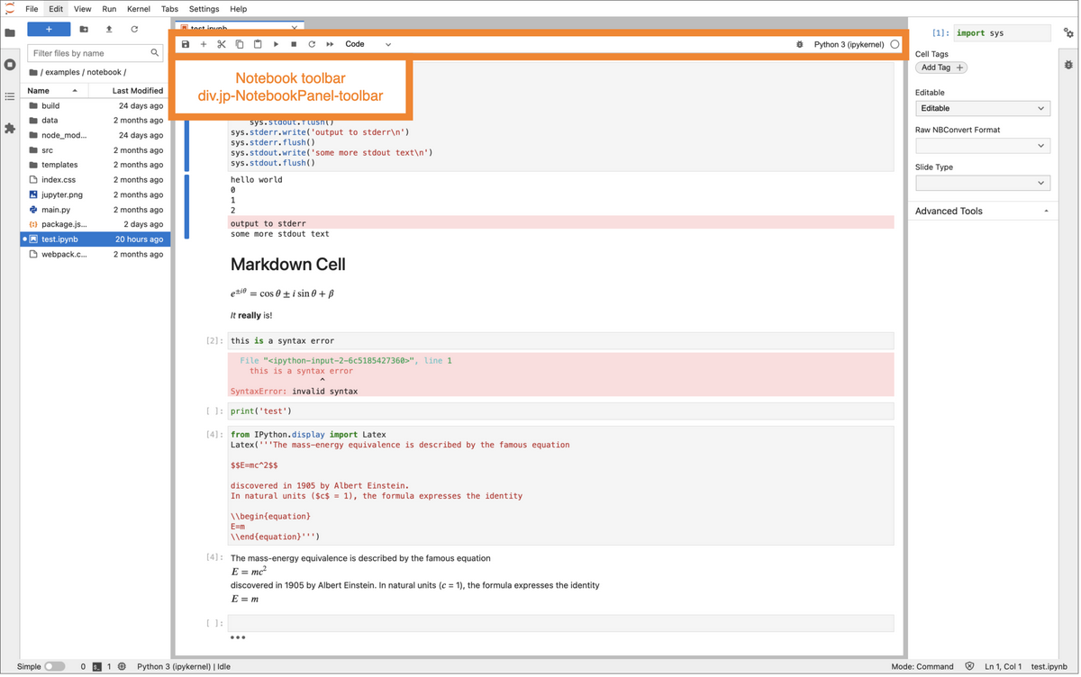
Node-to-node CSS selector path for this node:
div#main > div#jp-main-content-panel >
div#jp-main-vsplit-panel >
div#jp-main-split-panel >
div#jp-main-dock-panel >
div.jp-NotebookPanel >
div.jp-NotebookPanel-toolbar
Table of properties:
Name |
Value |
|---|---|
HTML tag |
div |
HTML id |
none |
CSS class |
|
HTML role |
|
aria-label |
|
Controlling class |
ReactiveToolbar extends Toolbar extends Lumino Widget |
Steps to mount:
When the NotebookPanel widget is created (see above), it creates its own toolbar.
It then adds the toolbar to its layout (BoxLayout), so that when it gets attached to the DOM, so will the toolbar.
Notebook content#
The notebook content is where the actual document is rendered for display and editing.
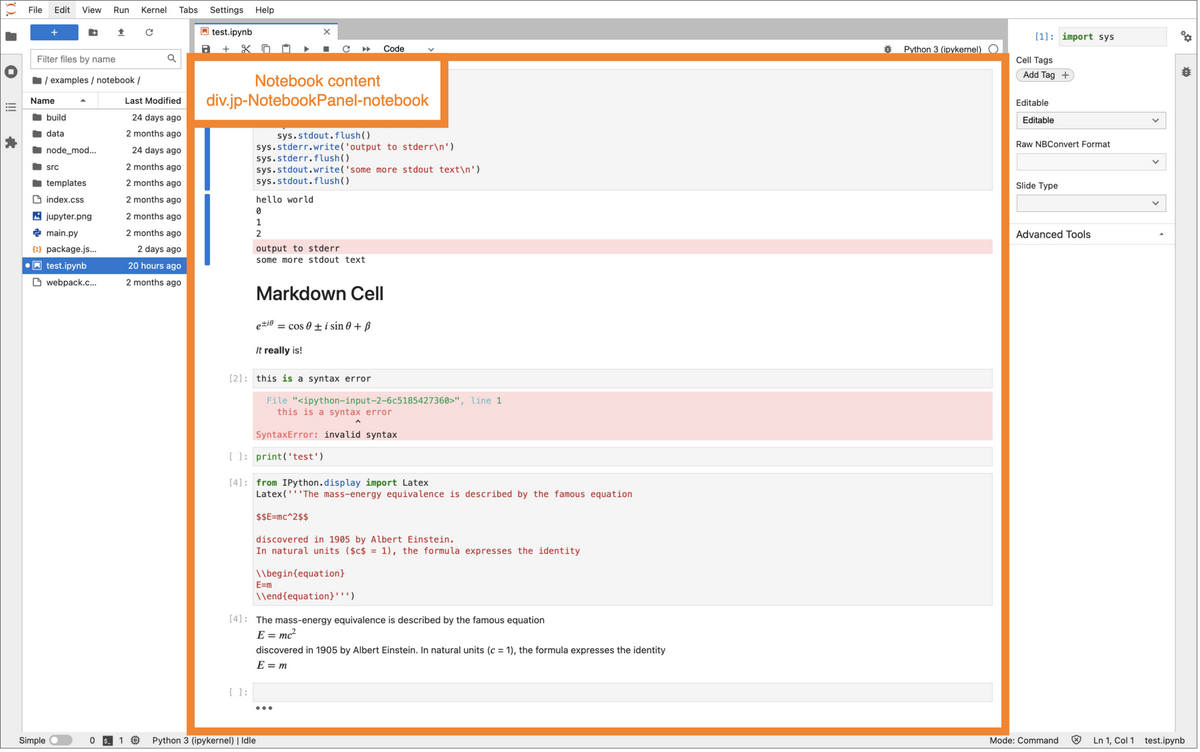
Node-to-node CSS selector path for this node:
div#main > div#jp-main-content-panel >
div#jp-main-vsplit-panel >
div#jp-main-split-panel >
div#jp-main-dock-panel >
div.jp-NotebookPanel >
div.jp-NotebookPanel-notebook
Table of properties:
Name |
Value |
|---|---|
HTML tag |
div |
HTML id |
|
CSS class |
|
HTML role |
|
tabindex |
|
aria-label |
|
Controlling class |
Notebook extends StaticNotebook extends Lumino Widget |
Steps to mount:
When the doc manager uses the notebook widget factory to create a new notebook panel, it passes in a notebook instance to the notebook panel constructor.
The notebook panel constructor (through the
MainAreaWidgetparent class) adds the notebook widget to its layout, just like the notebook toolbar, above, so when the notebook panel gets attached to the DOM so does the notebook body.
Notebook toolbar item: save button#
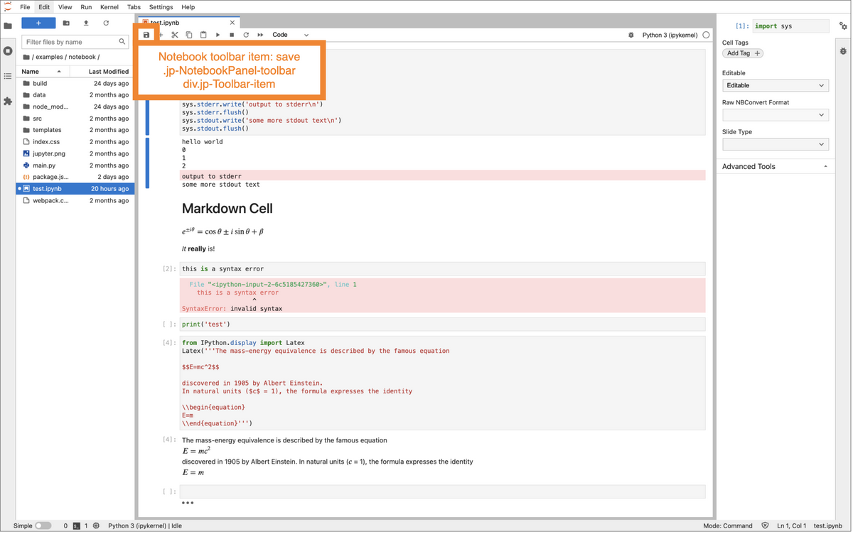
Node-to-node CSS selector path for this node:
div#main > div#jp-main-content-panel >
div#jp-main-vsplit-panel >
div#jp-main-split-panel >
div#jp-main-dock-panel >
div.jp-NotebookPanel >
div.jp-NotebookPanel-toolbar >
div.jp-Toolbar-item
Table of properties:
Name |
Value |
|---|---|
HTML tag |
div |
HTML id |
none |
CSS class |
|
Controlling class |
ReactiveToolbar extends Toolbar extends Lumino Widget |
Steps to mount:
The doc manager uses a factory to create a new notebook panel
The factory, using a toolbar factory, creates the toolbar items. Note: the toolbar items are gathered from a json file.
The toolbar factory passes each item to its own item factory. For example, the save button has its own factory.
The save button factory creates the save button, which is a React button wrapped in a Lumino Widget.
The notebook widget factory adds the save button to the toolbar. The toolbar passes the save button to its layout, which is a Lumino PanelLayout that handles putting this node into the toolbar node tree.
So when the notebook toolbar gets attached to the DOM, so does the toolbar item.